Wednesday 18 December 2013

I'm still counting this as Wednesday!

So I was hoping to have my character sculpt finished by the end of today so that I can start retopologising, this is where I have got to:


As you can see there is still much to do and a lot of tweaking to improve the likeness and finish off the sculpt but I think I would have been able to get most of it done tomorrow if someone didn't quit working at Bistrot Pierre today leaving me with a shift from 12 p.m. to 12 a.m. tomorrow. Friday is now my goal. The main things I'm wanting to correct/do are:
  • Sculpt more of the skin detail on the face
  • Re-adjust the jaw to be wider and more like my own.
  • Adjust the trousers to be wider from front to back as they look fairly odd at the moment.
  • Work into the boots, pouches and hands/arms more.
  • Apply a weave texture to the rope.
Once I have done these things I feel the sculpt should be read to retopolgise however a major worry at the moment is getting the hair to look right and staying within the tri count. I am significantly behind my ideal schedule as I wanted to have almost finished the texturing by now allowing me to rig and tweak for a while. Unfortunately life has got in the way but I'm going to focusing on this project a great deal to make sure it is finished to the best of my abilities and reflects the amount of work I have put into it.

Saturday 14 December 2013

Assements... what to do next

After receiving the fomative feedback a week ago I have been working out goals and ideas of what to do with the feedback and how to progress from here. I have come up with some techniques and systematic approaches to work from in order to create a better and more efficient workflow especially for Game Production where there were a couple of minor issues which need to be addressed.

Firstly I have started working on a flow diagram which I can follow for each mesh before I put it into engine. I am also working out some folder structures that I can use and some photoshop organisation to use. This will hopefully eliminate ngons, floating verts, unsmoothed areas and unnamed objects. Below is a work in progress of the flow diagram which will eventually address the issues with exporting meshes.


Considering that during the week I am in the labs everyday as much as I can be, I have decided that I'm going to try and dedicate Saturday and Sunday to personal briefs, blog posts and catching up on work I'm behind on. Unfortunately from January I am still working at Le Bistrot Pierre, I have recently been needed to work a lot more than desirable, 6 days a week, as its December and so my work load has increased to a degree that I am not very comfortable with. I have discussed this with them and we're trying to work out how I can work as little as possible.

At the moment I am working on the BMW art test, the Mortal Engines Character project and re-doing a final for Visual Design. In my assessment I was told that there were some key areas that I need to improve with my painting work because of this I was told to redo some final pieces to show improvement and maybe bump me up to the very good mark. As I am very keen to show this off I have decided to redo my Bradgate Park final with more depth, layering, compositional adjustments, compositional improvements and have more emotive elements.

This is where I've got to with the Mortal Engines sculpt, I'm behind schedule but I'm pretty happy with how its coming out and I'm enjoying sculpting more than I expected to. Still lots to do but I hope to be done by Wednesday evening so I can retoplogise and start texturing.


The BMW art test is slowly becoming more and more of a fully formed idea and I've got to the point where I can start making assets which I'm planning to do on Thursday. Below is the white box showing the idea of what I'm going to make but I don't feel I have the time to paint it even though I would quite like to. At this point I'm uncertain whether I will use Max, UDK or Cry to render the images, I'm wanting to do it in Cry but that is teaching myself another program so may not be the best choice. Again I'm behind schedule but I have planned out what assets I'm going to make and how I'm going to go about it.
Final Idea, unpainted to save time.

My initial idea of a subterranean modern art house.
My second idea, questioned/shot down because of the grimey-ness BMW being a more premium brand.

First whiteboxing of a dock scene, I thought it was far too large scale with not enough modular pieces.

Monday 2 December 2013

Elements of Game Design: Visual Composition

Visual composition is a very simple concept but is incredibly difficult to use effectively. It is simply the arrangement of visual cues whether in a still image, video or interactive experience. It is one of the key aspects to art which is often overlooked by art students but is studied thoroughly by successful artists.

Leonardo Fibonacci helped the study of composition to no end, much of what we know in terms of how to arrange images is down to his work in mathematics. The Fibonacci sequence led to a better understanding of "The Golden Ratio", this had already been discovered and used by ancient Greek sculptors such as Phidas. "The Golden Ratio" is represented in maths as the Greek letter phi, Φ, this is important as it shows us composition has been studied for thousands of years but more importantly composition is a fairly mathematical concept. It is important to remember the roots of these things and to remember that the old masters, whether you are talking about the Renaissance painters or the Greek sculptors, were not artists as artists are seen today. They were scientists, philosophers and mathematicians, if anything their art work came from this study and intrigue into understanding what was around them and how to communicate that understanding.

Below you can see a mathematical diagram of "The Golden Ratio", this is often simplified or slightly modified to be called the "Rule of Thirds". The two different ideas are slightly different but they are very similar. To use "The Golden Ratio" you split the length of the canvas using the ratio of 1.618:1 from left to right, right to left, then from top to bottom and bottom to top. This will give you a grid like the image below, you then position the points of interest and focal areas on either the line or the intersection of the lines.

Golden Ratio: Red, Thirds: Blue. Source.

Most artists have taken advantage of this technique, below you can see some examples:

The Fighting Temeraire by Turner Source
Seurat's Bathers at Asnieres Source
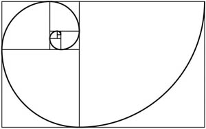
From "The Golden Ratio" comes the Fibonacci Spiral below you can see this spiral and the method for creating it. 

Fibonacci Spiral Source
Method for creating the Fibonacci Spiral Source
Applying this spiral to compositions allows the image to flow in a natural and interesting way which leads the viewer in, it creates an almost natural composition. When applying this to artwork it is the focal point that you want to rest within the spiral or at least near it. This is another way to create the affect seen from the "The Golden Ratio" or Rule of thirds but is slightly different.

The Mona Lisa clearly showing use of the Fibonacci Spiral. Source

Twitter's designers showing off Fibonacci's Spiral. Source
Twitter really love using Φ. Source


Just as a music needs both to flow and break to create a pleasing composition, these elements are also required in visual composition. This can be achieved in use of value, colour, placement and many other simple techniques. The aim of our work in the field of games is readability and understanding, we are visual communicators. It is important that we make understanding easy for the viewer this allows them to dissect whether they like it or not without being put off by confusion.

Sources:
http://landscapelearner.wordpress.com/2011/01/21/golden-ratio-rule-of-thirds-and-rabatment/
http://www.goldennumber.net/art-composition-design/
http://www.kurtzgraphicdesign.com/new-twitter-design-based-on-the-golden-ratio-image/

Friday 29 November 2013

Elements of Game Design: Planning and Concepting

The process of beginning a project is key to understanding the likely standard of the end product. It is incredibly important to make sure that the brief is clearly set out and that there is an element of structure to the design/creation process. Referring primarily to my own work I can start to pick apart the processes I underwent to realise the project and whether this helped or hindered the end result.

For every project the first stage should be research, collecting ideas and images from appropriate sources to aid in the design process. The research is often in various different areas:

Themes
Visual Style
Accuracy/Believability (anatomy, scale, pre-existing examples)

Studying the design process of other artists is also greatly helpful in coming to a successful design process of your own. I have recently been admiring the work of Paul Richards and I have been analysing what makes the work so successful to me. So far one of the overriding points that makes the work successful is the way it achieves its goal, concept art is about explaining and describing it a design art-form. Design is the root of what makes these sketches work. The next thing is simplicity, not necessarily simplicity of design but simplicity of readability. Readability being key for a design, do people understand how they should react to it? If its a medical bed, as below, people can quickly read that its a medical bed and know how important that is to them at the time.


Above linework is really important but material definition isn't necessarily important as the bed is made of mostly the same type of material however with the heads below you can see a really nice and simple demonstration of the different materials, skin, hair and metal. This simplicity and easy readability means that the designs can be understood without much deliberation, this is ideal for concepting.


See more of Paul Richards work at autodestruct.com
This kind of research has really helped me understand how to improve my concepting abilities and so I'm always on the lookout for how to communicate my designs better. All of this research put together means that you spend less time later on reference gathering, changing ideas or simply not knowing what to do. This initial research sets the project up. Without enough research the project is likely to become more of a strain and less of a smooth design process.

The silhouetting or idea generating stage is as important if not more important than the later stages. Just as the proficiency of the initial sketch greatly affects the proficiency of the end painting no matter the skill of the painter. At this stage of the design process I've found it both incredibly difficult and incredibly important to leave my preconceptions behind and look at what I'm actually working on. Focusing on the design process rather than the finished project often manages to keep my focus on the project for longer.

I find that my more successful projects haven't necessarily been those with heaps of silhouettes more the projects where an idea has managed to continue from the start of the project to the end of the project. This often means not going with the idea that jumps out at you at first but the idea that makes the most sense and fits the brief the most. Subtlety at this stage helps me later on, not choosing the explicit more extreme choice but rather choosing the believable.

Organisation of files is also very important, below you can see the groups of my latest concept for my mortal engines character. You can see that all the groups are labeled with what they are so that if I were passing my files around to other artists to work from they could find everything they needed easily and within one file.


Lastly numbering of ideas is just a very simple but very essential part of concepting, this just allows people to pick out which idea they want to talk about. Below is the figure concepts for my mortal engines character and you can see that if someone wanted to talk to me about them they could easily tell me which idea they are talking about.


Tuesday 19 November 2013

Reflection on first year...

Well uploading this is somewhat late considering the date. Having experienced the first section of second year my reflections on first year have been somewhat solidified.

If I think back to how I was when starting the course I am very pleased with my progression not only in ability but in mindset, thought process and ambition. The work I produced in first year is definitely nothing to impress anyone however it gave me the fundamentals of what I'm doing now. First year was a year which really showed me what I enjoy doing and what aspects of art I enjoy. My brothers influence on me is still overwhelming and I am drawn to the technical and logical. I also am starting to realise that what I really enjoyed doing at A-level and before was Design and Technology, Art had just seduced me. I am still happy with my wheelie bin but realise the issues with it. I think I may have to give it another go sometime soon. With the first years coming up to their tree project I think I may try and revisit the tree assignment which was most certainly my worst project last year. I need to improve on making foliage...


I feel that, being brutally honest, the 3D skills that I learnt last year could have been learnt in a significantly shorter time and because of this I'm slightly annoyed that I didn't teach myself anymore outside of University work. I am trying to take this thought process and apply it to now. With every project there are a couple of things we will be taught by the course and I want to try and learn as many other things which are related to the project as possible. Even with projects that aren't explicitly directed towards the area of the industry I want to enter I want to make sure I learn as much as I can. With the current Vehicle and Character project I am trying to learn elements to use in other areas. For example my whiteboxing ability and understanding needs improvement and so with the vehicle project I am trying to work on this. The modelling of the vehicle has helped my modelling speed. I'm going to try and continue this.

I am incredibly keen to do all that I can to get into the industry, it is because of this that I am going to build my portfolio as much as I possibly can. I am also going to apply for as many internships as possible and try to get my work seen by people in industry. I do not want to limit myself to the games industry but at the moment that is the area that I am most keen to explore. With the BMW art test I am doing all I can to make this an environment that I can both use for portfolio and to enter into the art test. For this reason I am trying to stick to AAA game type budgets so that I am still being considerably restricted with tris and texture sheets but I am also making something impressive.

Wednesday 13 November 2013

Orthoplex - Alternative Nightclub

Here are the final renders of Orthoplex's exterior... maybe I'll make the interior someday.


Friday 1 November 2013

An Update on Orthoplex!

So I've been really enjoying this project and I've been learning a great deal. We went through a tutorial on modular construction where rather than model the meshes and then texture them instead you create a texture and then apply that texture to a plane and detach faces which are the sections you want... That sounds more confusing than it is. Here is a more detailed version of my concept which I'm working from.


To start off I worked out from the other buildings that I was going to need a texture along this lines, so I spent some time creating this texture making it tile and griming it up.


I then applied it to a square plane with 16 rows and columns because I had made all the lines of the texture line up to a grid of the same amount of rows and columns in Photoshop.


Then detaching the faces I wanted and deleting the excess triangles.


A little extrude from the border gave some depth to the asset and then I reset the pivot point.


Above you can see a selection of the different sections to the building and below you can see the parts that I imported into UDK.


Below is a screen shot of the assembled building with place holders for the floor and walls. I am going to make windows and a piece to cover the corners tomorrow.


Here the pillars look far too clean and so I wanted to apply some dirt as if they had been around for a while but this wouldn't have built up around the top of the pillar so I had to tackle that challenge. I ended up unwrapping the pillar on the 3rd UV channel to give me a completely different unwrap to the one I initially had. This meant that I could make a grime texture which would make its way up the pillars rather than be applied uniformly. So far I have only done this for the main pillars at the front which are both the same mesh however I will do this for the side pillars tomorrow. Below is the result of a couple of hours of tweaking, googling, getting confused and finally understanding.


Monday 28 October 2013

Orthoplex

Orthoplex is an underground alternative nightclub in New York. With a sci-fi, cyberpunk aesthetic, alternative dance music and lots of coloured light. Below are some of my whitebox concepts and the start of some of my exploration of emissive-ness. The pillar design is based off the idea outlined in the video at the bottom, the effect of the designs I found incredibly beautiful and definately fitting for this kind of nightclub to be using. The pillar you can see below is textured with a 128x128 32bit texture with the emissive texture in the alpha channel.


Thursday 24 October 2013

Trash... and Building

With the trash project finished and handed in I've started to think about the building project and simply for myself and to get into good habits I'm going to setup a thread on polycount where I will post the process. When I have it set up I will post a link to it on here, in the mean time here is some trash!


The rendering was incredibly tough and I found it very difficult to show the asset off. However using Marmoset I managed to get some renders that I'm pretty happy with. The main thing that I would have done differently had I done the project again would be looking more at the silhouettes of the bin bags as at the moment they're a bit too sharp for my liking. I would also try and create more objects to put into the scene as at the moment I feel I used a great deal of texture space and great deal of the tri limit on a few assets.

Tuesday 15 October 2013

Drawing People...

I find that life drawing so far in the new studios is far more comfortable. Less sweltering, less obstruction and shorter more productive sessions.

Week 1 - variety of 1-5 minute sketches

Week 2 - 15 minute each

Saturday 12 October 2013

Abbey Park *WIP*


After a session with Mitch Small talking about getting values right before working on colour I decided that this would be a great technique to start developing. Here's the digital work I've done for this project so far. I'm keen to improve this work so I've been getting as much critique as possible. I may continue to work on this project hence the WIP in the title.


Sunday 6 October 2013

New Year, New Building, New Teachers...

With all the new things this year has come a new Visual Design teacher, Mitch Small. He is a graduate of this course who went on to work for Codemasters as a Concept Artist. His lessons have already taught me some very helpful techniques and have reminded me of some of the key aspects of concept art.

Last year the third years, when critiquing my work, would often talk a lot about getting your values right and how a painting will look very wrong without the values being right. I took away from their crits that I should stay away from full black and full white, which I understood and tried to take into account. However Mitch has taken this and explained it properly and below you can see an explanation of what "getting your values right" means.


I made this explanation sheet during Mitch's class on values and colour. There are 4 balls which have exactly the same grey-scale values. I have simply made a colour layer to colour them the different colours; this is where it is easy to see what happens when you get the grey-scale values wrong in an image. As each colour has a range of values that it will look right in, if you do this and use the same range of values for different colours the colours which don't look right will quickly show themselves. Here you can see green and orange come out very muddy rather than clean like the red and somewhat blue.

Here I have somewhat corrected the values for the green and orange balls in the middle and for comparison the originals are beside them.

EDIT: When I asked Mitch if this explained what he was meaning he said yes but those are horrible colours and you'd never use them. The green square approximately shows where most colours should come from.